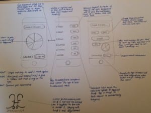
Above is a quick draw up of my idea for re-designing the personal budging app I previously looked at. My ideas collectively create a simple and easy to use app that navigates around a personal budgeting routine, one to suit everyone differently. Bottom left of the picture shows a quick draw up of my logo idea. Unfortunately this logo narrows my audience appeal to the UK due to my use of the pound sign, however it clearly represents that this is a second edition app and it connotes the idea of money and income.
