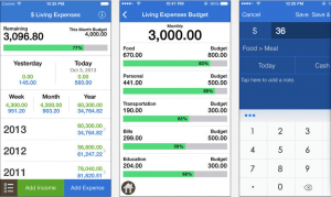
After a quick look at some of the applications provided in Apple’s app store, I noticed a similar occurrence between each and every separate interface. Each application resembled more of a bank statement and seemed to tell you what you were spending rather than helping you budget and manage your money. The overall design of many of the interfaces was poor and lacked vibrance, with text too small to read and dated colour schemes. The App ‘Spending 2’ lacked a personal edge and was not adaptable to the daily spending routines of individuals. Ultimately, I found that each application I looked at did not impress me or make me want to purchase it, ironic really when a personal budgeting application should focus on encouraging you to spend money on valuable and useful items.
